
Background
Mobile apps have many UIs with Bar in their names: Tab bar, Toolbar, Status bar, Menu bar, Navigation bar, Sidebar, App bar, Gesture bar, and so on.
Do you know which UI each of these refers to, and properly understand their purposes and constraints? And do you understand that the same name can refer to different UIs or have different behaviors between iOS and Android?
Also, did you know that following the OS26 announcement and the Material 3 Expressive announcement in 2025, those names quietly changed?
This article aims to give an at-a-glance overview, so designers and engineers should make sure to read the official specs thoroughly. The official Figma files are also well organized and worth checking out — they make it easy to understand “Oh, this is what this look is called.”
- Apple
Summary of Names by Section
Below is a summary of the names and appearances of Bar-style UIs. Where possible, each name links to the official documentation, but iOS doesn’t keep older docs around so those have no links.
The bar UI at the very top of the OS
| iOS | Android | |
|---|---|---|
| Current | 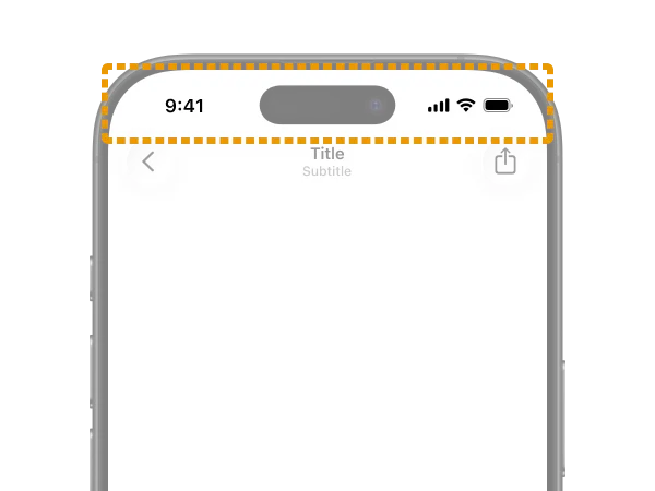 Status bar | 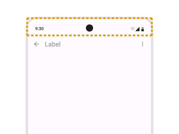 Status bar |
| Previous | 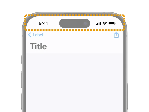 No name change |  No name change |
This one is straightforward. It’s the system UI that displays things like the clock, network, and battery — i.e., system status.
In general, there’s not much developers can customize. You can hide it for full-screen content like video players or games.
The bar UI at the very bottom of the OS
| iOS | Android | |
|---|---|---|
| Current | 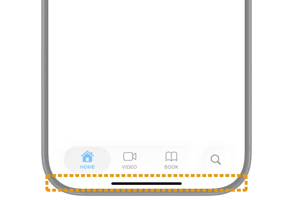 Home indicator |  Gesture bar (the name used in the official Figma) |
| Previous | 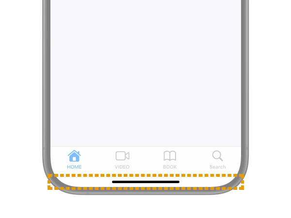 No name change | 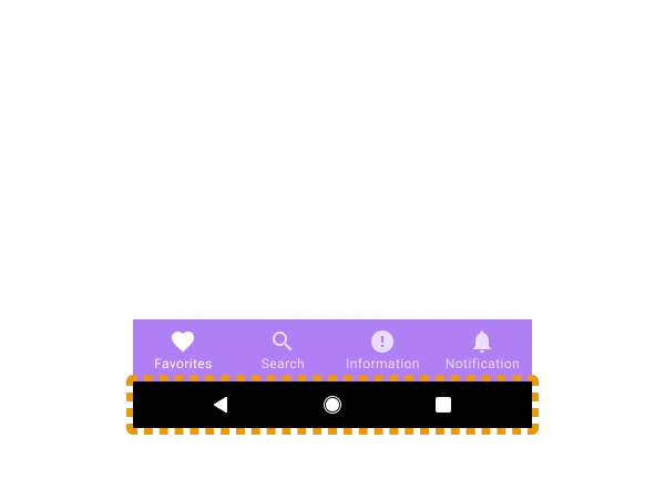 Android navigation bar |
It’s the system UI for returning to the OS home screen or switching apps. Just like the Status bar, developers don’t usually need to think about it much.
I couldn’t find an official guideline for Home indicator itself, but it’s a name that often appears in developer documentation (example) and user help articles.
On Android, this is sometimes grouped with the Status bar and called the System bar. The name Gesture bar isn’t actually used in the official guidelines, and some Google articles still refer to it as Navigation bar. However, since Navigation bar in Material Design 3 now refers to the tab UI described later, this is probably becoming incorrect going forward.
The Bar at the top inside an app
| iOS | Android | |
|---|---|---|
| Current | 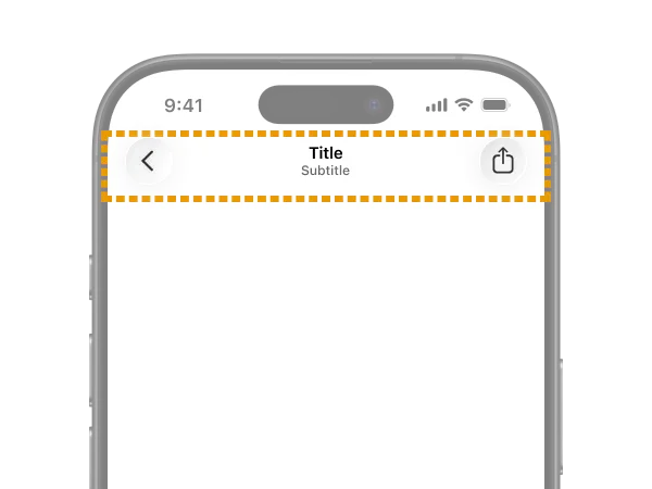 Toolbars | 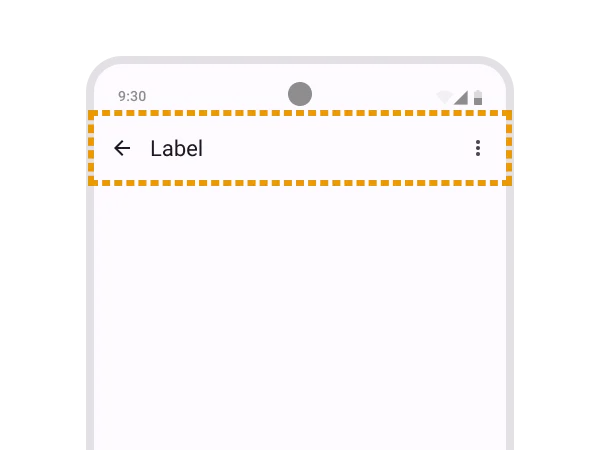 App bars |
| Previous | 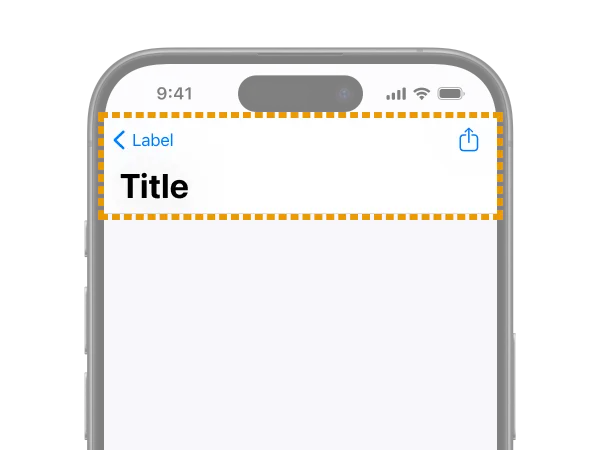 Navigation bar | 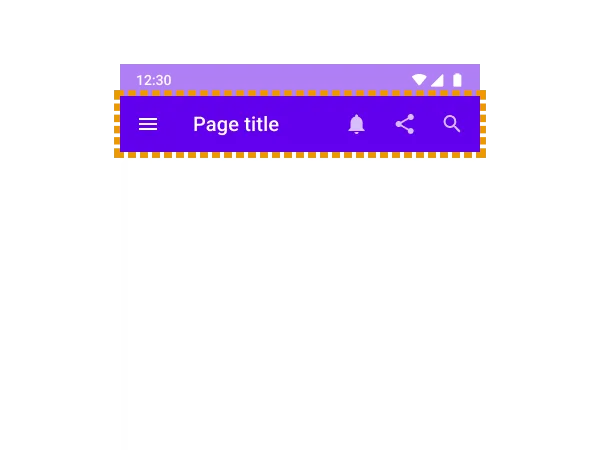 App bars: top (Top app bar) |
The Bar that shows the current location within the app or holds the back button. In the web world, it’s often called a Header.
This is the most difficult and confusing one. Be sure to check it together with “The Bar at the bottom inside an app” coming up next.
On iOS, Navigation bar was the official UI name, but starting with the HIG update for OS26, both the top and bottom were consolidated into Toolbars. However, the HIG includes the following note:
In iOS, a navigation-specific toolbar is sometimes called a navigation bar.
So apparently it’s still acceptable to refer to the top Bar as Navigation bar. This is probably because the name still appears in many docs and implementation APIs, but it’s confusing.
On Android, the opposite happened: previously both the top and bottom were called App bar, but they were split so the top is App bar and the bottom is Toolbar. Ahh, so confusing…
The Bar at the bottom inside an app
| iOS | Android | |
|---|---|---|
| Current | 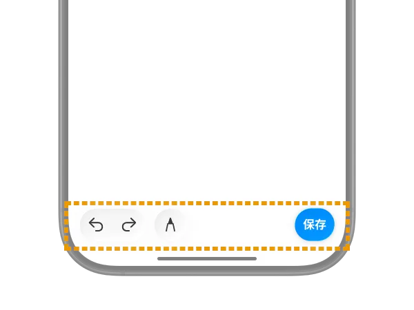 Toolbars | 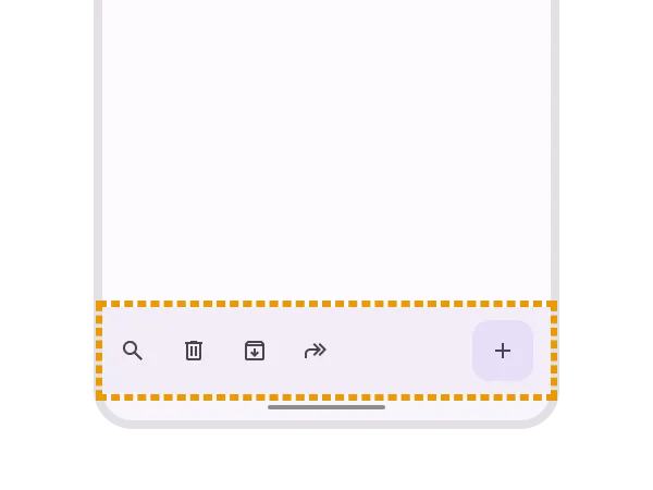 Toolbars |
| Previous | 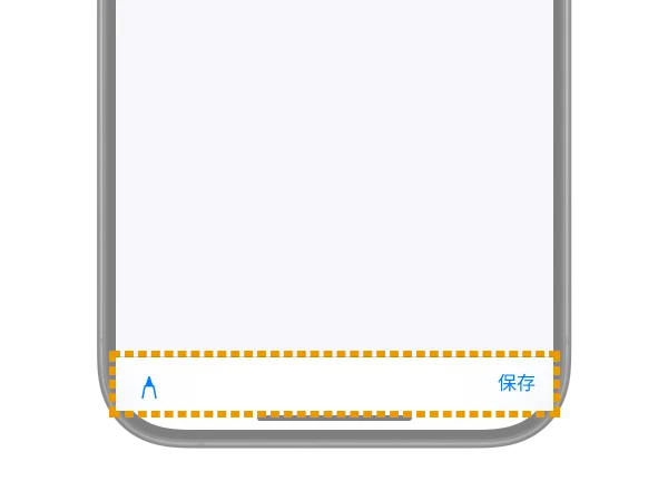 No name change | 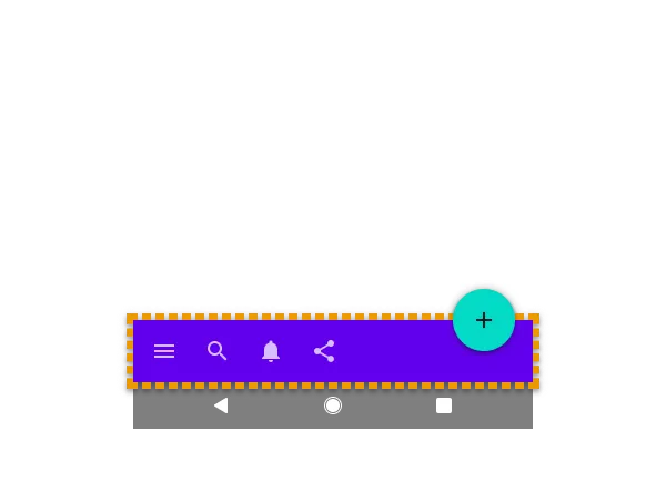 App bars: bottom (Bottom app bar) |
This is the Bar for performing actions on the current screen. It doesn’t appear that often. In the web world, it’s often called a Footer.
It’s displayed in the same location as the next “Tab bar for global navigation” and looks similar, but it’s a clearly distinct UI.
Tab bar for global navigation
| iOS | Android | |
|---|---|---|
| Current | 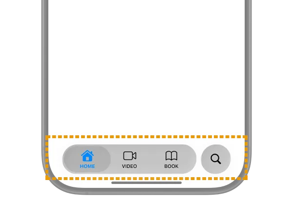 Tab bars |  Navigation bar |
| Previous |  No name change |  Bottom navigation |
Yes, the name Navigation bar shows up again. On Android, the bottom tab UI is now called Navigation bar going forward.
On iOS, it has always been Tab bars and the name hasn’t changed. However, its behavior and appearance have been getting major updates frequently, which is rough on developers. In OS26, as you can see, it now has a glass-like appearance and floats and morphs in placement.
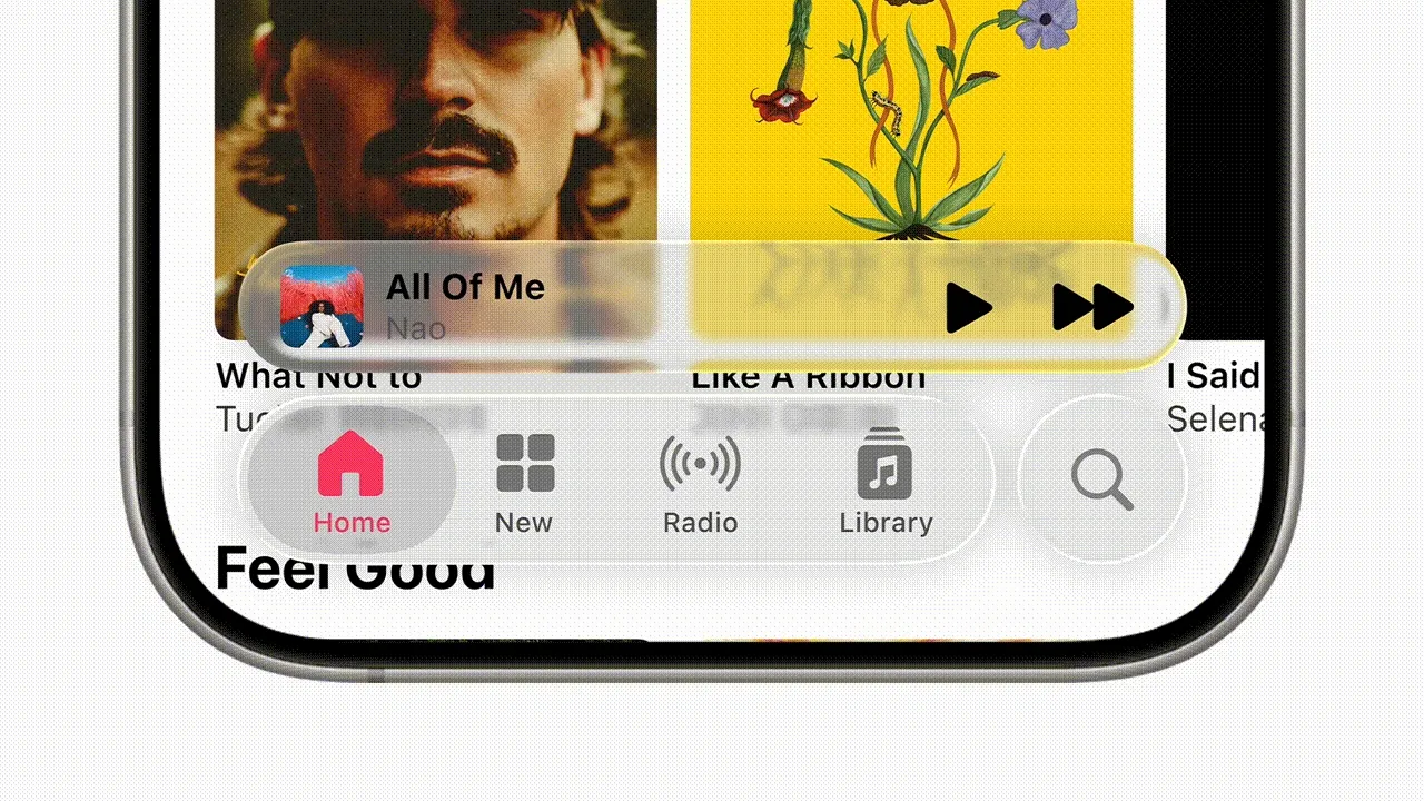
Reference: Apple introduces a delightful and elegant new software design - Apple
The Bar shown for notifications
| iOS | Android | |
|---|---|---|
| Current | None |  Snackbar |
| Previous | None | 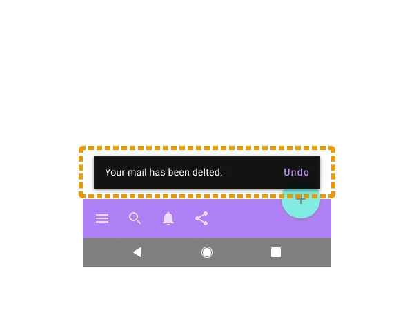 No name change |
This is the auto-dismissing notification UI defined in Material Design. It’s commonly called a “Toast” UI, but on Android, the OS-displayed error UI is sometimes called Toast and distinguished from this, so be careful.
Toasts overview | Android Developers
On Apple platforms, this kind of auto-dismissing toast-style notification UI doesn’t exist natively. Apps often implement similar UIs themselves, and they’re conventionally called HUD (Head Up Display) or Toast. Native iOS notification UIs include Alerts and Action sheets.
Bonus: Other UIs with “Bar” in their names
So far I’ve mainly covered phone UIs, but if you add iPadOS, a few more come into play.
Sidebar

Sidebars | Apple Developer Documentation
Like Tab bar, this is a navigation UI for moving between sections within an app. On iPadOS, it’s recommended to either show Tab bar at the top or use Sidebar instead. You can also implement it so Tab bar and Sidebar are integrated, letting users switch between them.
https://developer.apple.com/design/human-interface-guidelines/tab-bars#iPadOS
Sidebar is intended for use on iPadOS, macOS, and visionOS, and is not recommended on iOS (iPhone), so be careful. If you have a similar purpose on iOS, it’s appropriate to use Tabbar or Sheet.
On Android, Navigation drawer, Navigation rail, and Side Sheets are used in similar contexts. None of them include Bar in their names.
The menu bar
The menu bar | Apple Developer Documentation
A horizontal menu UI that appears at the very top of the screen, outside the app. It’s a staple of macOS and Windows desktop apps. Starting with iPadOS 26, it will be displayed in every app on iPad as well.
A similar pattern shows up in Android (or rather Material Design) with Menu, used in similar ways on certain screens.
It’s a mouse-centric UI, so you don’t need to think about it for phone-sized screens.
Wrapping up
If you have questions or corrections, please reach out via X or similar.
While we’re at it, let’s recap. Navigation bar means:
- On Apple-family OSes, the header UI at the top of an app (this is a legacy name; the current official name is
Toolbars) - On the current Android OS, the tab UI at the bottom of the app
- On the older Android OS, the system UI for returning to home (some official docs still use this meaning)
That was confusing.